Communicating with colours
Energy, Positivity, Joy, these and many other pleasant concepts are linked to the image of colour. Colour is life, and it assumes a great importance in communication being able to stimulate psychological and emotional effects, because colour defines our world.
As Leatrice Eiseman, executive director of the Pantone Colour Institute, quotes: Colour is the first thing that is remembered and the last thing that is forgotten and is an identifying element that connects us with the environment.
The psychology of colour has been studied since 1810, when the Colour Theory of the philosopher J.W.Von Goethe was published. At the moment, the studies and information collected on this topic represent a primary resource to define colours in all areas of design and communication.
In our society, colour is not just a sensation, but represents an idea or an expectation, to the point that certain colours become one with objects and it will be difficult to think of them in a different version. For example, think of a pencil, which will be yellow, a Ferrari, which will be red, an orange that will be orange and a kiwi that will be green.
Incredibly consumers faced with a choice between a yellow pencil and a red, or a kiwi green or yellow, will automatically prefer the more classic version of the product, unconsciously attributing a higher quality. We are deeply rooted in the image of that product.
In the medical sector, colour is used to try to mitigate patient anxiety, and historically there has been a great use of green and blue nuances to communicate calm (green) and hygiene (blue). . But it remains uncontested that none of us has ever felt calmer in front of a doctor dressed in green instead of white, because the meaning of the color changes according to the environment that surrounds it and the sensations that we get.
In the last few decades, to make the medical environment less aseptic, we started to use more decisive shades, which cover the entire range of colours available, and almost obligatorily in recent years have been carried out countless research, international and national, to check the effect of colour on the patient.
Particularly interesting, because they were conducted on patients less conditioned by the social environment. The first study of the reaction to colour were on patients with Alzheimer’s disease, conducted by Dr Luann Nowak Etcher in Michigan, and another study was conducted by Sioh, Italian Society of Odontostomatology for Disability, recently presented at the international congress in Paris.
In the first case the patients showed great improvements to the vision of the blue and green nuances, and were directed in safe path, during the roaming phase and thanks to the instinctive reaction to the colour. In this case 30% of patients prefer yellow, cheerful and sunny color, and a 52% shades of blue, relaxing, the remaining opt for the most varied colors. On the other hand, caregivers prefer shades more related to the unconscious image that we have of a doctor because it conveys a feeling of greater professionalism.
. Probably because stimulated by fashion, or simply to make the working environment less monotonous, since 1992 we have witnessed a real revolution in the supply of colored coats. Pastelli be the first who "dared" the introduction of absolutely anomalous colours, such as reds, violets, yellows, up to and unimaginable colours for the time such as Greys and Black, just to mention some of the most popular colours, and that are now inserted in the life of the health worker and considered classics.
At this point, it is necessary a further consideration, since, driven by the energy of refraction, it is forgotten that the positive effect is achieved only and exclusively when combined with harmony. In the absence of harmony between the environment, people, the concept that you want to express and the personality of the operator, the colour ceases to have its positive value.
Although, it may seem simple to choose the colour of a uniform, usually matched or in contrast with the dominant colours of the dental office, it would be correct to spend more attention to be certain to achieve the desired effect, Always Leatrice Eiseman reminds us that, much of the success of a project, a product, a setting is based on the correct use of colour that, according to Pantone statistics, ranges from a minimum of 80% to even 95%.
There are many texts that indicate the meaning of the various colours, and now we all know the various meanings, but it may be useful a checklist to use in choosing:
The definition of the message we want to give: what are the keywords that describe the project? Playful, (for example in orthodontics) Powerful (if we want to strengthen our competence) Reliable (to convey serenity) Timeless ( if we want to maintain a classic appearance that lasts over time) and so on.
- Choose the basic colours that best demonstrate the message we want to give also according to our personal taste, without letting ourselves be conditioned by fashions and habits.
- Check what you propose on the target market to check for any similarities.
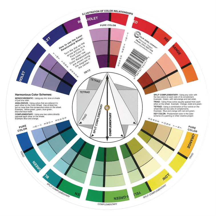
If we want to release the dental practice from the classic image of pure health service and create a unique environment corresponding to the message we want to convey, it would also be useful to use a classic tool such as the colour circle, also called "colour wheel" where you can select the appropriate shades.
In this way we will be able to create certainly harmonious and effective colour palettes:
Monotonous palettes, also called neutral, where everything will be composed of different shades of the chosen colour, for example in the case of monotonous very popular on gray scale, It will be important to insert absolutely different and important textures to avoid a strong flattening.
Analogues palette, colours that are adjacent on the wheel, and therefore have similar shades. Typical example is blue and green. Similar colour schemes are often found in nature resulting harmonious and serene and are the most used palettes in the health field.
Complementary Palette , composed of colours that are exactly opposite. They are the most difficult to use, because they create a strong contrast, typical example a combination of blue and red, to be used if you want an original effect, where, however, it will be advisable to use the combination in differentiated proportions, for example 80% blue and 20% red.
But to these results we can add the complementary colours fractioned, ( 2 shades of blue and one of red) triadic ( blue, red and yellow ) and finally tetracids ( Blue, Purple, Yellow and Orange) playing until you reach the desired effect.
Here is that even the simple choice of the Lab coat, usually made of impulse, would need more thoughtfulness to improve our and others' feeling of well-being.
Informative obligations for public grants: the State aid and de minimis aid received by our company are listed in the National Register of State Aid referred to in Article 52 of Law 234/2012, which can be accessed at the following link: https://www.rna.gov.it/trasparenza/aiuti